Wednesday, September 5, 2012

Flipping It!

There are some great homes in the Dallas area that were built with integrity and are still owned by the first resident.  As time marches on, they need to be spruced up to meet the needs of a new market of home owners.  Enter trusty builder Jim Womble of Savannah Custom Homes.  He always finds homes with the best bones, then calls his favorite interior designer (yours truly of course!) to help him put on the polish.  He has great vision and it's always a pleasure to work together.

No "before" pictures this time.... just the finished product.  

The kitchen is open to a great dining nook so we wanted a show stopping feature!  The backsplash is light grey subway tile with a glass subway tile accent.  The cabinets were in great shape, so after a quick sanding they were ready for a deeper stain color to make them current.

Clean and simple front entry!  We kept the original ironwork but everything else was updated.  I love how classic the color combinations feels!

The hall bathroom was really the biggest update!  The original this tile was the 1950's blue and was not in good shape.  We did classic white subway tile but paired with a great glass tile.  I selected a warm grey neutral for all of the walls and I LOVE how it turned out.

Wednesday, August 8, 2012

Book Case Reborn

If you live in an older home you are likely graced with charming architectural details that so many people crave: lovely moldings, ceiling details, arched openings, and built-in bookcases.  As times change and the way we live our lives evolves sometimes these charming details turn into conundrums.  E-readers have obviously changed the way we read books and honestly, unless you are reading beautiful hardcover classics...you likely aren't going to be using the bookcases the way they were intended!  

Here are some great ways to add a little charm back into your bookcases.

So what...you like reading chic-lit!  That doesn't mean you can't make those pink covers coordinate into your decor.  Consider making covers in a solid paper for a great disguise.

Arranging a carefully edited grouping of classic accessories will feel very sophisticated.  Just be sure to give everything breathing room so it doesn't look like a nick-nack resale shop!

If you are still into the nostalgia of reading things on actual paper adding glass doors with some details will polish up the multicolored book covers and the mish-mash of different book heights.  A little cohesion can go a long way in dressing things up.

Tuesday, July 31, 2012

#DesignDilemma: Mirror Above Console

Everyone has questions as they navigate their space spruce ups.  Sometimes you end up with a list and decide to call in for professional back-up, but sometimes you just have one question that is plaguing you.  I can help!

#DesignDilemma: Mirror Above Console

"Ok, so here's my design challenge...My husband and I got this mirror at an art/antique fair over Memorial Day weekend. It is a 19th Century French piece. We like the spot in our living room where we hung it, but are unsure of how to "style" around it. Would love your thoughts! Our style is contemporary casual and we want this room to have an effortless elegant vibe. We love the scale, look and story of this mirror, but it feels "weird" to us right now. We have existing lamps in front of it, but are open to change."  -Chicago Couple


These are my thoughts: 

I love that you are mixing styles and periods in your home!  It makes your space so much more interesting.  The mirror has a great classical style and is very symmetrical so you need to either play into the symmetry (which is what you are doing now) or go for an asymmetrical composition for a complete departure and make it really stand out.   

For starters I would consider scootching the mirror down.  It might be about 3" too high, which is TOTALLY nit-picky but I'm just throwing it out there!  I would shoot for the middle to be around 5'6" from the floor (or just 3"-4.5" above the top of the console).  Here are two quick sketches...they might look like a crazy person drew them, but don't be afraid.

1) Symmetrical:  Since you already have a pair of lamps this might be the quickest fix.  Your current lamps shades are the culprit in the "weird feeling" you mention since they over hang the decorative side panels.  It creates an awkward break for your eye.  If you replaced the shade with something smaller to fit within the confines of the side portions, your eye will be pleased!  See buffet lamps and lamp shades: http://www.horchow.com/search.jhtml?N=0&Ntt=buffet+lamp&_requestid=1620

2) Asymmetrical: I lean toward this for you because the style of your console (and the rest of your house from what I can see) is more contemporary than this mirror.  If you depart from its classic cues, I think you'll make it stand out as an art piece.  I drew a little swooping line to represent how the composition should be higher on one side and float down to the other.

I've drawn it with a larger lamp to anchor the arrangement.  It would be amazing if it was a warm neutral color to play against the cool color of the mirror and pull out the golden colors in the frame.  Try it with a sleek glazed pottery or glass for an added texture (like the above.)
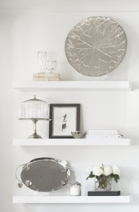
I would then put two smaller objects that vary in size next to lamp like these great coral pieces (like the attachment labeled collection).  On the opposite side stack a couple of great coffee table books and atop place a small vessel potted with a succulent or something earthy…like moss or driftwood.

You have to send some picture when you are done:  Its going to be so special!

Friday, July 27, 2012

Fab 5: MIA Blogger

So, you will be relieved to learn that I am not actually Missing in Action!  Just blessed beyond belief (BBB for short....) with great clients the past few months!  So, it seemed only fitting that for July's Fab 5, I'll be giving you a recap!

Fab 5: Where have you been?

1) Moving a "Fabulous Couple"
Earlier this summer, I had the excellent opportunity to work with a young couple that bought their first home!  They were also celebrating their first wedding anniversary abroad and already had the trip booked during their impending move.  What is a Fabulous Couple to do?  Call in reinforcements!  While they were away, I coordinated new floors installation, electrical updates and refreshed the paint.  On move day, they left for work from their current residence and came home to their new house.  Everything was set in place and ready to use.  I couldn't have done it without my team of awesome movers.  We are working now to spruce up some of their formal spaces!


2) New Projects!
I'm working with a hip Austin resident to "Keep Austin Chic!"  I like weird as much as the next gal, but I much prefer a chic living space.  The guy that inhabits these walls has a great style and isn't afraid to mix styles to create something that has an Austin vibe.  Above is the progress on his dining space.  I see poker nights in his near future!

It's no secret that I adore working on rooms for the pint size population, but I was able to expand my horizons to create an awesome space for a Teenage Gal.  The whole family is so full of life and I loved being a part of this spruce up.  Here is a small sneak peak.  I'll post more pictures later, but I can't give away everything here!


3) Sprucing up HQ for BR Interior Designs

One of my favorite phrases to describe my house is "The cobblers children have no shoes...."  Don't get me wrong, I love, love my abode, but as a designer I know there are so many projects that have yet to come to fruition. I keep them tucked nicely in my head and the second I get a few extra dollars (or let’s be frank...when my husband goes out of town...) I execute a few projects.  My latest overhaul is in my office... AKA "BRHQ"  The image above is just a teaser of one of the great elements.

4) Winning!

I won an award for my Hip Family Dining Room Project!  I am honored to be named alongside great Dallas designers with an Honorable Mention by American Society of Interior Designers in their Design Ovation Awards.  I continue to be so proud of the spaces I design and receiving outside recognition is stellar.  Check out the list of other winners as well!

5) Dwell with Dignity
Charity work is something I am very passionate about.  After all, I am BBB, so I think its necessary to spread the love around and to stay constantly thankful for everything in my life.  What better way than to share my talent and passion!  I've mentioned Dwell with Dignity before and most recently I'm working on a team from the American Society of Interior Designers to complete an apartment install for a family on a journey toward a fresh start.  Check out their website!

I promise to be a better blogger, but if you find yourself needing a design fix, check me out on other media too!
Twitter   I   Facebook   I   Pinterest

Wednesday, April 18, 2012

#DesignDilemma: Dormer Window in Bath

Everyone has questions as they navigate their space spruce ups.  Sometimes you end up with a list and decide to call in for professional back-up, but sometimes you just have one question that is plaguing you.  I can help!

#Design Dilemma: Dormer Window in Bath
"My guest bath has a dormer window in it which creates this long narrow space. I have no idea what to do with it, it's just collecting random furniture right now. Ideas?"  -Amanda Vaughn
1) I think you need to create a "destination" in your window nook.  It will make it feel like there is a reason for it and create a special spot in what was once an awkward corner.  A built in window seat is just the thing!  It will also add a touch of leisure to the room by implying you have the time to sit and relax after a long bath.

2) I love storage.  Especially in functional spaces like bathrooms and kitchens!  Think about incorporating drawers to store those loose odds and ends.  Your seat height should be about 18" - 20", so if you opt for a cushion be sure the wooden base below is 15" - 17" to accommodate a 3" cushion.  Also, consider using an indoor/outdoor fabric so you don't have to worry too much about water or humidity.
3) If you don't want a cushion you can also do an all wooden hinged top for storage.  If you go this route, be sure to add detail along the base as shown in the image above.  You don't want it to feel boring.  Also be sure to use the type of hinge that locks open so nobody slams their fingers!

If you have a question Tweet to me @BRInteriors with a picture and brief description along with the hash-tag #DesignDilemma.  I'll post your solution on my blog and tweet you back.  If you don't have twitter, you can post it on BR Interior Designs' Facebook page.

Tuesday, April 10, 2012

#DesignDilemma: Above Cabinet Display Space

Everyone has questions as they navigate their space spruce ups.  Sometimes you end up with a list and decide to call in for professional back-up, but sometimes you just have one question that is plaguing you.  I can help!

#Design Dilemma: Above Cabinet Space  

From @HigherEdGirl: "I have a #designdilemma: the space above my kitchen cabinets. The blank space haunts me daily! Suggestions?"

1. Be sure whatever you decide to display in this space, that it doesn't completely fill the space.  You want there to be room to breathe between the top of the object and the ceiling and some empty space side to side.  I would keep the space above the cook top empty but nestle two groupings on either side.
2.  It looks like you are working with a really great tonal color scheme.  Keep that going with whatever you place up there to make it feel purposeful but with interesting shapes so that it isn't boring!  Mixing materials and sheen is one of my favorite ways to add interest into a space. Like with these pieces, ceramic, smokey glass and metal play nicely off one another. I would place a grouping like this on the side that is a focal point or an area you see as you walk into the space.
  
3.  You can also consider storage on top, in the form of an interesting metal basket.  If you are storing something unsightly consider lining the basket with white linen.  If you don't necessarily need extra storage, I love how they placed selenite logs in this image! Depending on the lineal space you have, I would do a grouping of two or three of the same bins.

If you have a question Tweet to me @BRInteriors with a picture and brief description along with the hash-tag #DesignDilemma.  I'll post your solution on my blog and tweet you back.  If you don't have twitter, you can post it on BR Interior Designs' Facebook page.

Sunday, April 1, 2012

Fab 5 on Five: Give Away!!!


Everyone has favorites.  The "go to" places or things that are always the right fit for their sensibilities.  Designers are no different!  If asked, they have a list of favorites for any category in design, whether it's their favorite show stopping sofas or their most coveted accessories. Below is another installment of a monthly "Fab 5 on Five", a compilation of my favorite things on (or around..) the fifth of each month.

This month I'm kicking it up a notch.  I'm not going to just tease you with 5 fabulous design worthy objects, instead I'm actually going to give them to you!  April is the perfect month because there are 5 Mondays in which to spread the love.  All you have to do for a chance to make these yours is keep your eyes out for the posts on BR Interior Designs Facebook page and @BRInteriors on Twitter.  There will be opportunities for doubling your chances, so pay attention!

I picked these goodies because they are just type of thing that will look great in any space while giving it a little extra pizzazz. They are some of my favorite staples to give life to a space, without breaking the bank!  The fun starts today and continues until the last Monday in April.

Fab 5: Design Staple Give Away

1) A crisp candle in an classic container.  I think a room with a candle burning feels warm and inviting. With the recent weather change, I like to start burning something with a light scent.  A simple container helps them fit into any decor.

2) A great metal Buddha head from Big Mango.  Add this to a console for a bit of glint and ethnic flair. 
3) A classic herringbone pattern on a neutral throw blanket from Peacock Alley will definitely add some coziness to your space.  Drape it on a guest bed or on the arm of a chair to invite settling in.

4) Coffee table books are a staple that can be placed on almost any surface to express your personality and add color.  I love the red of this book cover, so I removed the dust jacket.  Stack these two together to show your design sense.

5) A $50 gift certificate to Dirt Flowers so you can bring in Spring with an artful natural arrangement.  Give the talented florists a smooth glossy vessel to place the arrangement.  The mixture of textures is something you are sure to LOVE!

Tuesday, February 28, 2012

Getting It.

Whew! I finished up the Extreme Makeover service project at the Promise House this weekend!  It was two busy days full of paint, dust, drilling and running around.  I went into the weekend full of energy and ready to get started giving these teens an exciting new room.  I left the weekend physically exhausted but full of the joy of doing something worthwhile.  In total our group of 30 women spruced up 8 rooms that can house 21 teens!  All of the spaces were so different but they all looked significantly cleaner and cheerier!  Here are the after pics from the room I helped on.  To see some more photos go to the Promise House's Facebook page.

Our budget was $180 to complete the overhaul and luckily one of the savvy ladies in our group convinced the amazing people at Sherwin Williams to donate ALL the paint!  

Here is what we got for the money:

$60: Three brand new comforters from Target
$20: New curtain from Target.  Its actually a shower curtain onto which I painted a green stripe!
$25: New curtain rod
$36: Three desk lamps with storage from Wal*Mart.
$28: Two blue side tables
$11: Art supplies and clips for pictures (see below)

The new paint color says "Teenager" instead of "Baby Boy" and balances the vivid colors in the existing carpet.  We used the pops of color from the carpet for the rest of the room, adding bright blue and green throughout.  The new curtain is actually a shower curtain and to add a little more pizazz, we painted the green stripe on the blue patterned background!


Our custom art project of blue and white chevrons adds some graphic punch of color to a smaller wall.  Each piece was made by a different team member, so they are all different and add a lot of personality.

Since this is temporary home, we drilled small clips onto the wall so they can change out pictures, drawings or clippings within their space to give it a sense of their own personality.  The awesome sketch in the picture was in the room when we started renovating, so we wanted to hang it up for our resident!  The black square above the desk is painted in chalkboard paint so they will hopefully not draw on the other parts of the wall!  The new lamp is stocked with a full supply of brand new chalk in its organizing cubbies.
Just a little proof that this designer isn't afraid of getting her hands a little dirty!  And you better believe I was still peeling paint off my hands for a few days....

Tuesday, February 21, 2012

Giving It.

Sometimes it's the little things in life that are easily overlooked and that with which we should be the most thankful.   A family that loves and supports, enough food to go around, and a roof overhead. At the Promise House, Dallas homeless and runaway teen can find those basic needs.  It's a safe place to recover from desperate circumstance and get back on the right track.

So, why I am telling you this?  Well, I am volunteering with a group of ladies from the Junior League of Dallas to "Extreme Makeover" the shelter's bedrooms!   The time is short and the budget is SMALL but the impact will be great.  Here is a before picture of the boys room we are assigned.

The carpet is very patterned and colorful but cannot be changed. There is a really fun chalkboard-paint outline of the Dallas skyline that we are keeping.  The paint color is a really depressing blue (a shade I call hospital blue...) and the drapery is pretty much see through.  There is a serious lacks of charm.  Check back to see what we've come up with!

Thursday, February 16, 2012

Playroom for Two

I am so excited to be working on another space for children!  This time its a Dynamic Duo of twin boys and the space is their playroom.  These little men are a little over one which is a great time to hire your first designer and put your stamp on the world! (Ok, their mom technically hired me but we are all working for these Two!)

The home was built in the early 1930's and has a classic style; so we are keeping this room clean and neutral.  The room will have a great display area for all things "play" and a daybed for cuddling up with a good book.  After all, these are important men that will need to multi-task.

Here are some elevations sketches that I did to show this discerning duo.   We are moving quickly on this room, so I should have some progress snap-shots soon!

We are going to place two long shelves that are low enough for the little guys to get direct access to everything fun!  Above we'll place the object that require supervision, like special books and art supplies.

I'm reconfiguring the layout of the existing twin size bed to make it more of a day bed.  Also we are framing some existing art pieces from the home owner. 

Friday, February 10, 2012

Impulse Accessorising: Kisses

Most of the time there isn't enough money in the budget for a complete overhaul of a home or room and most of the time people would like a little something new to keep their spaces fresh and evolving.  A few new accessories on a console, mantle or side table can breath new life into a room without being cost prohibitive.

From time to time I come across a piece that I would categorize as an "impulse accessory."  It has to be under $100 dollars (so it doesn't require any major savings or a family discussion) but also it needs just enough style to make an impact.

Since its almost Valentines Day, I thought we should get a little romantic.  Don't get the wrong idea... I already have a handsome Valentine.  I'm talking accessories and particularly these fantastic place card holders.  They are created by Dallas' own F is for Frank and are perfect for a romantic night in. With different types of kisses called out on the tag, you are sure to let your Valentine know what type of action you are anticipating. (anything from "Eskimo" to "French")  They will only set you back $35 a piece!  That deserves a Smooch.

Wednesday, February 8, 2012

Fab 5 on Five: Raising the Bar

Everyone has favorites.  The "go to" places or things that are always the right fit for their sensibilities.  Designers are no different!  If asked, they have a list of favorites for any category in design, whether it's their favorite show stopping sofas or their most coveted accessories. 

Below is another installment of a monthly "Fab 5 on Five", a compilation of my favorite things on (or around..) the fifth of each month.   I've been asked by another designer recently to help him concept a new bar/restaurant space.  We worked together in the past and right now his plate is FULL.  In honor of this great rekindling here are my Top 5 Dallas Restaurant Designs.  How could I pick with the surplus of amazing options? Well, based on the designs ability to create an atmosphere that gets you excited for the food experience!

Dallas Amuse Bouche Installment:

No. 1: Hattie's in Bishop Art.  Fried green tomatoes are served elegantly in the monochromatic space.  The room is sun shiny, elegant and crisp.. which partners nicely with some low-country shrimp and grits.
No. 2: Medina Oven and Bar in Victory Park. You would never wonder if the food was bland in a space with this much vibrancy and I'll assure you it is anything but.  The furnishing layout is just as cozy as their sharable small plates.. you just might make new friends at the next table.

No. 3: The Oak in the Design District. Tailored and cozy with plenty of understated "Oak" references, you know this is the place to be fabulous while enjoying bites like Duo of Kobe Beef or Celery Root Fries.
No. 4 Bolsa in Bishop Arts.  Locally sourced and honest food are what you'll get at Bolsa.  The restaurant says to me, "Hey we are hip, but down to earth." Mixing materials in warm hues and exposing the ceiling let you know its time to kick back and enjoy some goat cheese from Dallas Farmers.
 
No 5: Rise No. 1. on Lovers. The idea of a souffle is light and whimsical.  So is Rise. The table is set with antique linen used as napkins, paired with french silver and re-purposed wine bottles as drinking glasses.  With this sort of attention to detail, you know your souffle will not "flop!"  (check out Hedda Dowd's other en devour, an antique business which sources fantastic tableware pieces from French Chateaus.)

Friday, January 27, 2012

International Inspiration: Thailand II

Especially in comparison to the landscape of Texas, Thailand is a rainbow.  Granted you might have to look past some murky water or streets to see it, but that might be part of the reason that it jumps out.  Whether is on the buildings, flowers or clothing there was an abundance of color inspiration!  

International Inspiration: Thailand Color
From the Royal Grand Palace.  Amazing gold and glittery tile with impeccable detailing. 
We were able to stop at a floral show that was in honor of the King's birthday.  They had a spectacular showing of orchids.  I love the tropical pink and yellow with the crisp white on these guys.

 
Now, people aren't just walking around in these get-ups but they are traditional tribal clothes from the northern regions.  Fun patterns in cheerful colors make for very chic tribal ladies.
Marble edging at the Royal Grand Palace is so subtly colored but its a fantastic discovery as you walk past.

The color of fresh and stir fried veggies, spicy red sauces and white and blue plates had me enjoying the meal before my first bite.

I LOVE the color of bright marigold this monk is wearing!  I wouldn't make a very good monk but I am terribly envious that they get to wear something so cheerful all day!

Thursday, January 26, 2012

International Inspiration: Thailand I

My husband and I decided to kick off the New Year in style by traveling to Thailand to visit family.  I had lofty plans of blogging while I was away to keep you guys up to date on my latest inspirations.... but I instead read my book and took in everything!  The weather this time of year was WONDERFUL and everyone there did their part to make sure we had an amazing time! Now, it's back to the real world for us....

  There was inspiration at every turn, and I always had my camera ready to capture it. I'm going to break the pictures down into groups so its not overwhelming.

International Inspiration: Thailand Architecture

Ancient temple ruin.  A series of temple (or Wat) sites were buried with only the top exposed.  They have recently been unearthed and they stored treasures ranging from golden Buddha's to Ming Dynasty pottery.
Beautiful Wat with elaborate dragon entrance.  All of the detail and color is so striking.
Spirit house at the previous temple image.  Read more about Spirit Houses.

Ancient Chedi that was constructed and then renovated by a few different rulers so the detailing is from different periods and styles...  Its also thought to house a gold Buddha.
Close up of the sculptures and carving.  Great patina.
New Wat that is still under construction by an artist that wants it to be the most beautiful building in the world.  Its an amazing statement in its stark white and mirror.
Gold Buddha... He's three stories high at least!

Worn steps at Ayutthaya: the old capitol of Thailand.  These steps have been trod upon since 1350.
Ayuttaya Stupa.  The texture and coloration on these bricks and statuary is fantastic!

 Fantastic statuary at Royal Grand Palace: The King's former residence.
I love all the detail in this tile on the building!

Exterior of the Wat that houses a Buddha made 100% from Jade.  Read its interesting story!